

Bright white exteriors are a bold, timeless choice that can transform a home’s look from simple to stunning. With its clean, versatile appeal, bright white creates a perfect backdrop for a wide range of architectural styles, colors, and textures. From sleek and modern to classic, elegant homes, white allows other design elements — like wood, stone, or striking accent colors — to shine. Check out some of our favorite designs using bright white for a sophisticated, fresh aesthetic.
Whether you’re looking for white exterior inspiration or you’re focused on a different color or design feature altogether, we’re here to help. Our designers will work with you to understand your specific tastes and goals. Learn more about our services.
Our real designers only use and recommend products that we know, love, or would use on our own properties. When you buy through our links, we may earn a commission, at no cost to you.

Complement with soft tones
For a clean canvas, bright white is one of our favorite paint colors. In this traditional design, we grounded the brightness of Sherwin-Williams® Pure White with soft, dusty blue accents. Our designers blended obvious blue accents (the front door, window awning, and shutters) with subtle ones (the window trim and hydrangeas) for a beautifully intentional appearance.

Create bold contrast
The muted green siding blanketing the entry is beautiful, but the star of the show is the bright white vertical siding on the rest of the exterior. Particularly surrounding the portico and alongside the black garage doors, the white adds contrast to the design. We also used white trim around the portico and for window trim, further illuminating the bright aesthetic.

Enhance sleek materials
Our designers love a good black-and-white color scheme, especially when a bright white and moody black are involved. For this design, we used Sherwin-Williams® Extra White on the vertical siding, exuding a sleek, clean look. The black metal roof is the ideal accompaniment for the siding, and the black garage door and accents throughout give this exterior a cohesive look. We especially appreciate how the bright white hue boosts the integrity of the smooth siding panels.

Visually lift the layout
Ranch homes are beloved for their convenient, all-one-level layout. Because of that characteristic, though, sometimes the color of a ranch exterior can create a condensed appearance. That’s where bright white comes in. The bold brightness of the brick on this exterior — rendered in Benjamin Moore’s Chantilly Lace — gives this ranch a facelift. Our designers still used plenty of dark accents on the exterior, but the white draws the eye and opens up the layout.
Embrace natural materials
For this home, we used Sherwin-Williams® Alabaster on the siding. While this white leans a bit on the creamier side, we used Benjamin Moore’s Simply White on the trim to give the exterior more of a bright white appearance. Our designers used plenty of natural materials throughout this design to infuse texture and dimension. We used wood throughout, on the garage, portico, deck, front door, and window trim. Plus, the stone skirting showcases a variety of deep neutral tones that stand out alongside the bright white.
The natural materials on the exterior tie in beautifully with the landscaping, where we blended rich brown mulch with a variety of plants and charming permeable pavers. All of the elements work together for a natural feel, and everything is anchored with the simple white shade on the siding.
We always recommend sampling and testing paint colors before committing. Factors such as natural lighting, undertones, and your property’s fixed elements will have a significant impact on how a color will appear on your exterior. Our friends at Samplize offer extra-large 9 x 14.75 inch peel-and-stick paint samples of the colors we love for exteriors. Order your ‘Real Paint, No Mess’ samples from Samplize here.

A modern flare
Bright white works wonderfully with other neutral tones. In this design, we used Sherwin-Williams® Greek Villa on the stucco. Balancing the brightness of the stucco, we weaved different shades of gray throughout for the trim. The brown tile roof, wood front door, and wood trim on the glass balcony railing welcome another realm of neutrals to the palette.

Amplified elegance
If you’re after a timeless, elegant aesthetic, bright white should be on your radar. Sherwin-Williams® Ibis White is the ideal cool, bright white paint for the brick on this house. To create a more warm and welcoming aesthetic, we opted for beige shutters and columns. The copper awning and light fixtures infuse the home with a luxurious essence, which is amplified by the Juliet balcony above the entry. For contrast against the bright exterior, we used a black front door.

Crisp and clean
Bright white might be the best color family if you’re after a simple, clean look. Here, we used Benjamin Moore’s White Dove on the exterior. Our designers kepy the accents simple with classy mounted lanterns flanking the entry, sleek black planters, and black rain chains. We embraced simple, uniform landscaping throughout, amplifying this neat, crisp aesthetic.

Lean into luxury
Our designers appreciated the luxurious layout and architecture of this home, and we amplified it with beautiful white brick, rendered in Sherwin-Williams® Zurich White. While the aesthetic is simple and classic, it is also dynamic, with a myriad of textures throughout. From the limestone turret encasing the entrance to the mix of pavers in the driveway and front steps, the textures add contrast. We also love the way the white hydrangeas throughout the flower beds complement the white exterior.

Keep it classic
What better palette to embrace if you want a classic aesthetic than bright white? Here, we used a bright white siding on the upper level, complemented by neutral brick below. Briding the two sections of the house, we used the same bright white on the columns and trim of the portico, along with the window trim. For a bit of visual interest, we added black awnings above the windows. The simple palette gave way for robust landscaping, which gives this exterior an elegant aesthetic.

A canvas for dimension
One of our designers’ favorite things about bright white is that it is entirely open to customization and interpretation. Just as canvases for painters are white, we think of a white exterior as a canvas to personalize with additional accents. For this design, we used a mix of cultured stone, wood, and black accents to create a compelling façade. Combined with the eclectic landscaping and staggered pavers, this white house exudes a contemporary vibe.

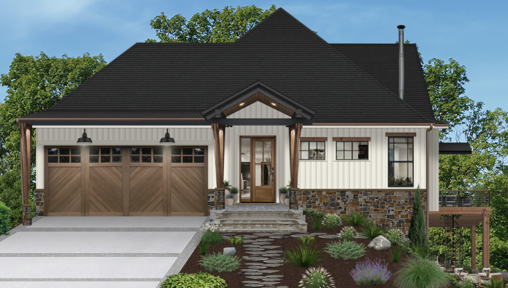
Warm it up with wood
Benjamin Moore’s White is the perfect crisp white for this architecturally interesting exterior. The bright white hue allows all of the home’s features to stand out. To complement the palette, we added wood accents throughout, creating a warmer, more welcoming aura. Wood pairs excellently with white, creating an aesthetic that’s both timeless and classic.

Bright, bold, & beautiful
Bright white exteriors offer endless possibilities to create a standout design, whether you’re aiming for timeless elegance, modern minimalism, or something in between. By thoughtfully pairing different shades of white with accents like wood, stone, and subtle pops of color, you can achieve a look that feels both intentional and unique.


