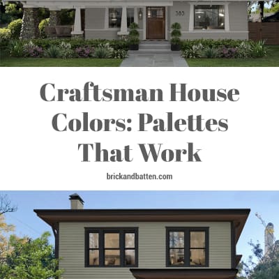
Craftsman House Colors: Palettes That Work
A Craftsman house is a timeless design style that first emerged at the turn of the 20th century. The architectural style was inspired by the Arts & Crafts movement of the mid-19th century. These homes are typically small-to-medium and have a slew of prominent features including:
- Low-pitched roofs and overhanging eaves, often with exposed rafters or beams
- Wide, covered front porches with distinct thick, tapered columns
- Gabled roofs with truss details
- Wood framing with stone or stucco accents
Craftsman houses have evolved with broad interpretations and are still a popular style. Notably, these homes were originally painted with earth tones. Today, you’re likely to see Craftsman-style homes in a wide variety of colors, though many homeowners still lean toward earthy color schemes when working toward this style. Read on for some of our favorite palettes for Craftsman houses.
Choosing a color palette for your home’s exterior is a big decision. At brick&batten, we understand that every exterior detail matters. Our expert designers can help you select the right exterior color palette for your home, and so much more. Learn more about what we do.
#1 // Black Beauty + Westhighland White
A classic black-and-white color scheme is both timeless and sleek, especially on a Craftsman house. Here, our designers suggested Benjamin Moore’s Black Beauty for the siding and Sherwin Williams’ Westhighland White for the trim. The juxtaposition of these two opposite shades creates striking contrast. Finally, the wood accents combined with the copper gutters take this eye-catching design to the next level.
#2 // Mountain Road + Tricorn Black
The earth-tone color palette our designers used on this Craftsman house meshes perfectly with its natural setting. Sherwin Williams’ Mountain Road is the ideal neutral for the siding, accentuated by the saturated trim in Tricorn Black by Sherwin Williams. Next, the stone columns and steps, wood front door, and landscaping accentuate the earthy field color.
#3 // Mountain Road, Aegean Olive, + Manchester Tan
Mountain Road doesn’t only work with dark paint colors — for this Craftsman house, our designers suggested a fully earth-tone palette. The subdued hue of Benjamin Moore’s Manchester Tan used on the columns and trim provides a gentle contrast to the neutral Mountain Road brick and stucco. From there, our designers used the darker Benjamin Moore’s Aegean Olive for smaller details, like the porch floor, windows, and attic trim, making the design more dynamic.
#4 // Urbane Bronze + Seapearl
Sherwin Williams’ Urbane Bronze is one of our favorite greige shades because of its warm, saturated feel. With so much range, the color works great across any style of home, and we especially love the way it translates on this Craftsman house. Benjamin Moore’s Seapearl is the ideal companion for a warmer, more subdued interpretation of the traditional black-and-white exterior color scheme.
#5 // Elemental + Aegean Olive
It doesn’t get much more charming than bungalow-style Craftsman houses. And this color palette is a huge part of the home’s curb appeal. We’re big fans of using two different paint colors for the upper and lower sections of siding for a color-blocked design. The multiple textures on the columns, door, and walkway further the feel of interesting layers. Our designers went with Benjamin Moore’s Elemental for the lower siding — a gray-green that is elevated by the surrounding landscaping. On the upper siding, Aegean Olive brings green undertones and contrast to the façade.
#6 // Iron Ore + Simply White
After a more rustic vibe for your Craftsman house? Our designers achieved just that, above, by making use of different textures and a striking color palette. The saturated hue of Sherwin Williams’ Iron Ore on the siding stands out against the bright trim, painted with Benjamin Moore’s Simply White. The wood accents give this sleek aesthetic a rustic flare.
#7 // Black Forest Green + Revere Pewter
If you want to make a statement with the exterior of your Craftsman house, a bold color like Benjamin Moore’s Black Forest Green should be on your radar. On the home design above, this daring, blackened green is complemented by neutral Revere Pewter by Benjamin Moore on the brick columns. Overall, this color scheme demonstrates a balance between subdued and saturated tones.
#8 // Revere Pewter + Midsummer Night
This moody color palette combines two beautiful Benjamin Moore paint colors: Revere Pewter on the main level and Midsummer Night on the upper level. The wood and iron accents on the porch bring out the deep, brownish black of Midsummer Night. Meanwhile, the warm neutral Revere Pewter siding brings a welcoming vibe to the porch and entry.
See a color palette that interests you?
The classic design of a Craftsman house lends itself to a myriad of color choices. A muted palette is inviting and classic. Or, you can go bold and make a statement. Either way, our team would love to work with you on the ideal aesthetic that will both boost your curb appeal and make you happy to come home every day.
Ready to work with our expert designers to manifest your exterior design dreams? Get started today!
Subscribe for more content like this!
